UI/UX & Design System
2026
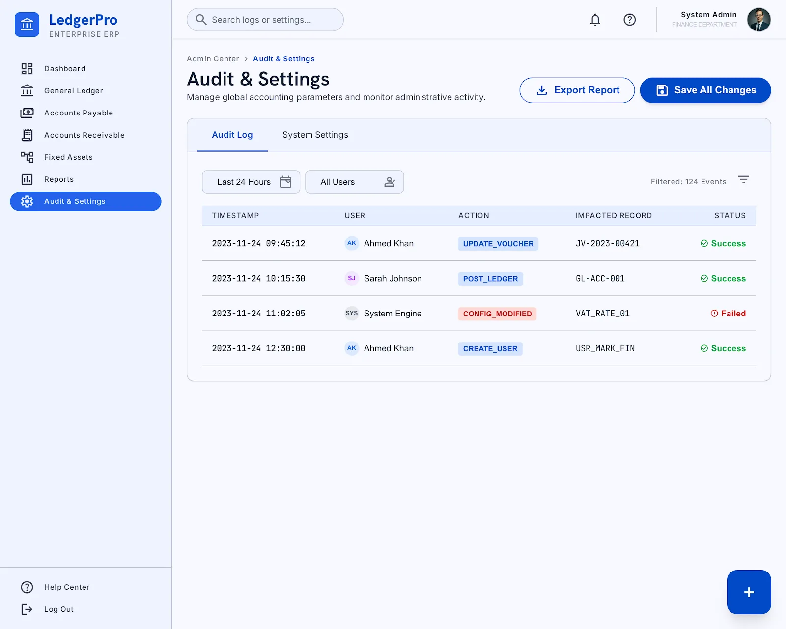
A full design system and 24-screen UI concept for an enterprise accounting ERP portal — chart of accounts through period close.
- Role
Product Designer — defined the token system and designed every core accounting workflow screen
- Year
2026
- Status
- Design Concept
- Stack
- Design System
- Hanken Grotesk
- Inter
- Figma-grade tokens
Overview
A complete UI/UX design system for an enterprise accounting ERP portal: 24 production-grade screens covering the full accounting workflow, from the chart of accounts to period close, built on a documented token system rather than one-off screen designs.
Problem
Accounting software is where "functional but ugly" is the industry default. Dense tables, ambiguous status states, and inconsistent spacing compound into real errors — a misread balance or a missed approval. The goal was an interface dense enough for daily accounting work but calm enough not to fight the user.
Solution
I started with tokens, not screens: a full color system (surface, surface-container at five elevations, primary/secondary/tertiary with fixed and container variants, semantic error colors) and a two-typeface type scale — Hanken Grotesk for display/headline weight, Inter for body and data — so every screen shares the same visual grammar before a single layout was drawn.
Architecture
The system is organized in four layers: Core Ledger (chart of accounts, journal entries, general ledger), Transactions (sales/purchase invoices, expense claims), Reporting (P&L, balance sheet, trial balance), and Operations (assets, budgets, cost centers, banking, tax/VAT, audit settings, period close). Every screen reuses the same table, status-chip, and form-field components.
Features
- Full design-token system: 30+ semantic color roles across five surface elevations, ready to drive both light interfaces and a future dark mode.
- A five-level type scale (display, headline, title, body, label) spanning Hanken Grotesk and Inter.
- 24 fully designed screens spanning the entire accounting lifecycle — not isolated mockups, but a coherent flow a real bookkeeper could follow start to finish.
- Consistent status-chip and data-table language reused across ledger, transaction, and reporting screens.
Development Process
Tokens and typography were locked first and documented in a design spec, then every subsequent screen was built by composing from that same palette and scale — the discipline that keeps a 24-screen system feeling like one product instead of two dozen.
Challenges
Accounting UIs pack in more data density than almost any other product category. The hardest part was finding a table and status-chip language dense enough to show real ledger data without needing a redesign pass for every new report type.
Results
A cohesive, documented design system covering the full accounting workflow — chart of accounts, journal entries, invoicing, reporting, assets, budgets, banking and period close — usable as the foundation for a real implementation.
Future Improvements
A dark-mode token pass using the same elevation system, and interactive prototypes for the period-close and bank-reconciliation flows.
25Gallery
Select any screen to open it full size.
01Core Ledger05
02Transactions06
03Reporting03
04Operations11
Work
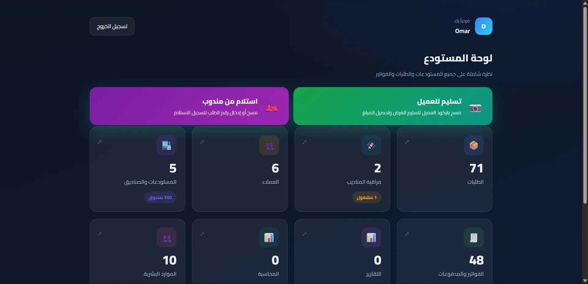
Warehouse & Logistics Platform · Web · 2026
Carry Go — Warehouse Portal
A bilingual warehouse operations portal — orders, attendance, payroll and embedded ERPNext accounting from a single interface.
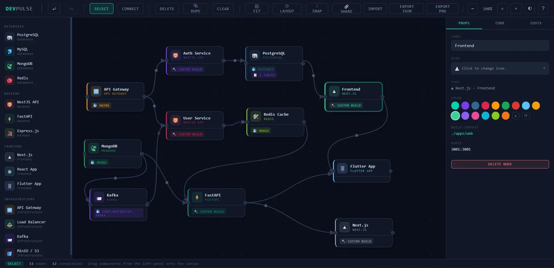
Developer Tool · 2026
DevPulse
A browser-based micro-system architecture and database schema designer — drag-and-drop canvas, live code generation, multi-select, pan/zoom, and one-click export to Prisma, SQL, Docker, Kubernetes, and Mermaid.